In the competitive world of SaaS companies, user adoption and retention depend on how effectively users understand and engage with your product. One of the best ways to ensure this is through product walkthroughs. These interactive guides help users navigate key features, boosting confidence and satisfaction.
By highlighting the product’s value early on, you can foster a deeper connection with users, making them more likely to stick around. In this blog, we’ll explore why product walkthroughs are essential, how to create engaging ones, and how to measure their success.
Plus, we’ll share real-world product walkthrough examples to inspire your own approach, helping you craft walkthroughs that leave a lasting impression on your audience. So, let's begin!
What are Product Walkthroughs?
Product walkthroughs are strategic, interactive guides that offer a dynamic, interactive experience to active users, helping them understand the main features, value, functionality, and navigation of a software product.
They can take the form of tooltips highlighting parts of the User Interface (UI), hotspots, interactive models, or even explainer video tutorials.
The walkthrough assists new users in getting acquainted with the software for the first time, as well as existing users being introduced to a new feature or product update. It also provides crucial guidance, driving user adoption and retention.
Product Walkthrough Vs. Product Tour: How are They Different?
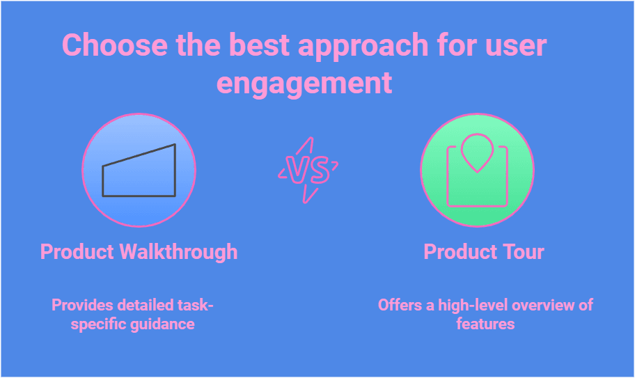
A product walkthrough is a step-by-step guide, often interactive, designed to help users with user onboarding and to understand and accomplish specific tasks within a product. It provides detailed instructions, ensuring users can navigate features effectively.
On the other hand, a product tour is a high-level overview that highlights a product's specific features and benefits, often aimed at introducing new users or showcasing updates.
In a nutshell, while walkthroughs focus on in-depth guidance, tours prioritize providing a broad understanding to engage users quickly.
Why Should You Engage Users with Captivating Product Walkthroughs?
Captivating product walkthroughs is pivotal in reducing friction and enhancing the User Experience (UX) for both your website and mobile apps. By offering users interactive product explanations, you reduce the risk of users abandoning the app or software out of frustration or lack of understanding during the onboarding experience.
Additionally, a well-crafted product walkthrough helps transition users smoothly to that crucial eureka moment—which can also be described as an aha moment—when they comprehend the value of your product and understand how to utilize it.
The importance of engaging in product walkthroughs becomes evident when reviewing statistics that indicate over 21% of users use a web app only once before abandoning it.
Therefore, attention-grabbing walkthroughs, such as those offered by a project management tool, are necessary to improve retention and user adoption rates.
When Should You Leverage a Product Walkthrough?
A good walkthrough fosters a seamless user experience, enhancing satisfaction and driving product success.
Here are a few scenarios when you should leverage a product walkthrough:
To onboard new users: Help users quickly grasp the basics and navigate your product effectively.
To educate your audience about new features: Ensure users understand and adopt updates or new functionalities.
To improve user engagement: Guide users toward discovering valuable features, enhancing satisfaction and retention.
To reduce support costs: Minimize queries by preemptively addressing common issues through self-guided instructions.
To cross-sell and up-sell: Highlight relevant features or upgrades during the walkthrough to drive additional purchases.
What are the Different Types of Product Walkthroughs?
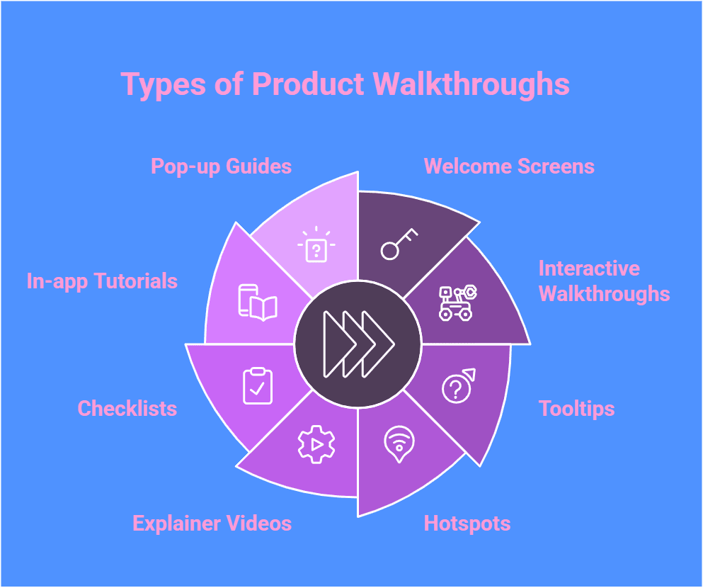
Product walkthroughs come in several forms, all designed to cater to different user requirements and preferences.
Here's a list of common product tour types:
Welcome Screens: They provide your product’s first impression, greeting users warmly and giving them a snapshot of what’s to come.
Interactive Walkthroughs: These immerse users actively in learning by doing, helping them understand your product from the word go.
Tooltips: These serve as your product’s in-built mentors, offering bite-sized, just-in-time snippets of wisdom to guide users.
Hotspots: They subtly draw users’ attention to a button or new feature without seeming too intrusive.
Explainer Videos: These provide engaging content that breaks complex processes into digestible narratives. They’re ideal for quickly and memorably clarifying the purpose of a feature.
Checklists: They provide users with clear, actionable steps, thus tapping into their psychological need for task completion.
In-app Tutorials: These provide step-by-step guidance within the app for seamless learning.
Pop-up Guides: They deliver timely, on-screen instructions to enhance understanding and navigation.
Each type of walkthrough has its strengths and is best suited to different contexts and user needs.
How to Craft an Engaging Product Walkthrough?
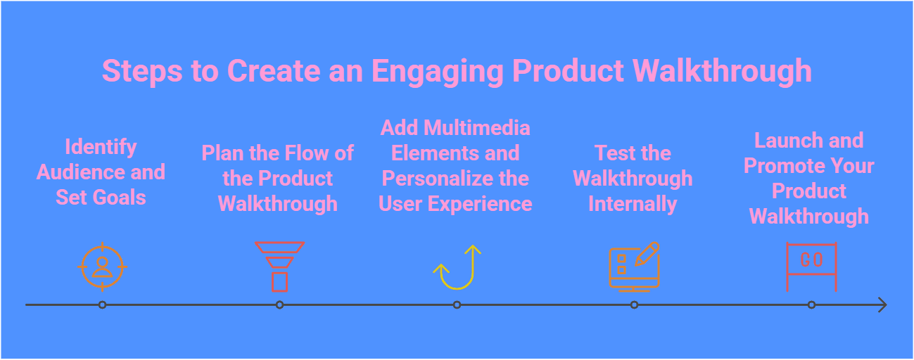
Crafting an engaging product walkthrough involves various steps, and following each one correctly is crucial. Let's discuss these steps in detail.
Step 1: Identify Audience and Set Goals
You may start by understanding your user segments and their specific needs for your personalized product walkthrough effectively. Define clear goals for the onboarding checklist walkthrough, such as increasing product adoption or enhancing user retention.
By identifying the audience and setting goals upfront, you can guide users through the onboarding process with a focus on feature adoption.
Step 2: Plan the Flow of the Product Walkthrough
Effective product walkthroughs require careful planning to guide users through key features while addressing the learning curve. Understanding user personas and their needs is crucial, as is aligning the walkthrough with specific purposes, use cases, and features.
Incorporating interactive elements and personalized experiences boosts engagement and retention while mapping the onboarding flow with UI/UX patterns ensures a smooth, informative user journey.
Step 3: Add Multimedia Elements and Personalize the User Experience
To enhance user engagement, incorporate multimedia elements like videos, animations, or interactive graphics into your product walkthrough. Personalization is the key; tailor the experience to different user segments based on their specific needs and preferences, leveraging advanced features to customize the experience.
By including personalized touches, such as custom user avatars or dynamically generated content, you can guide users through the onboarding process more effectively. This approach not only increases product adoption but also boosts user retention rates significantly by utilizing customer data.
Step 4: Test the Walkthrough Internally
Before launching your product tour, it's essential to test it internally to ensure a seamless user experience. Engage the product team members or a select group of users to go through the walkthrough and provide feedback.
This step helps identify any glitches, inconsistencies, or areas for improvement before opening it up to a broader audience. By conducting internal testing, you can refine the onboarding process, iron out any issues, and guarantee that the tour of your product effectively guides users through your product's key features.
Step 5: Launch and Promote Your Product Walkthrough
Now that your product walkthrough is finely crafted, it's time to focus on launching and promoting it. This step involves effectively introducing your interactive product tour to users. Utilize various marketing channels to reach different user segments, tailoring your promotion strategies to suit their specific needs.
Highlight your product's most essential features and benefits to entice users to engage. Remember, a successful launch and promotion can significantly impact product adoption and user retention.
How to Evaluate Your Product Walkthrough's Success?
Once launched, it's crucial to evaluate the success of your product walkthrough. This involves further tactics to follow. Stay tuned as we discuss how to evaluate the success of your product walkthrough.
1. Track User Engagement Metrics
Tracking user engagement metrics is essential to assess the effectiveness of product walkthroughs. Metrics like click-through rates, time spent on steps, and drop-off points offer valuable insights into user behavior. Analyzing these helps identify areas for improvement, while advanced analytics and A/B testing optimize the experience, driving better engagement and higher product adoption.
2. Analyze User Behavior
Analyzing user behavior is key to optimizing product walkthroughs. Advanced analytics provide insights into how users interact with your product, highlighting actions, preferences, and pain points for targeted improvements. Tracking behavior helps enhance the user experience, boost product adoption, and increase retention. This data-driven approach reveals patterns that guide refinements, ensuring the product aligns with user needs and preferences.
3. Gather Feedback
Gathering user feedback is also essential for optimizing product performance and understanding sentiment. Use feedback forms, surveys, and direct input to gain insights and apply NLP sentiment analysis to identify positive experiences and pain points. A continuous feedback loop helps refine the user experience, boost adoption, and support ongoing improvements.
4. Identify Areas for Improvement
Use user feedback and behavior data to identify weaknesses, focusing on engagement metrics to spot drop-off points or confusing sections. Analyze interactions to understand where users struggle or lose interest and gather direct feedback to highlight pain points. Overall, continuous improvement through data analysis and feedback ensures the product walkthrough is refined and optimized.
5. Use Analytics for Data-Driven Decisions
Leverage advanced analytics to make data-driven decisions now. Analyze user engagement metrics and behavior patterns to gain insights and identify areas for improvement. Track user adoption rates and use this data to refine the onboarding process and key actions to boost retention, and drive adoption. By making strategic adjustments based on data, you ensure your walkthroughs evolve to meet the needs and preferences of your user segments.
See How Others Are Thriving with SmartCue: 3 Product Walkthrough Great Examples
Ready to be convinced? Explore these inspiring stories of how SmartCue has made a real difference.
1. NexLvL

NexLvL, an AI-powered CRM platform, leverages SmartCue to create interactive and engaging product walkthroughs. These guided experiences, from self-serve demos to product tours, allow businesses to explore the platform's capabilities firsthand.
By showcasing the power of AI-driven automation, chatbots, and other business tools, NexLvL effectively demonstrates how its platform can streamline operations and enhance customer engagement.
SmartCue's seamless integration ensures a smooth and informative user experience, providing a valuable glimpse into the potential benefits of adopting NexLvL.
2. Guardey
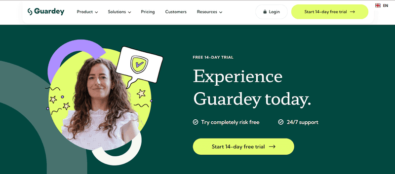
Guardey, a cybersecurity leader, effectively utilizes SmartCue for immersive product walkthroughs. The interactive demonstrations showcase the depth of their cybersecurity solutions, allowing businesses to gain a firsthand understanding of real-time threat detection and cyber awareness tools.
By offering self-serve demos and product tours, Guardey ensures businesses can easily explore their offerings and understand how to enhance their security posture.
This approach not only demonstrates Guardey's commitment to accessibility but also empowers businesses to make informed decisions about their cybersecurity needs.
3. OceanFrog
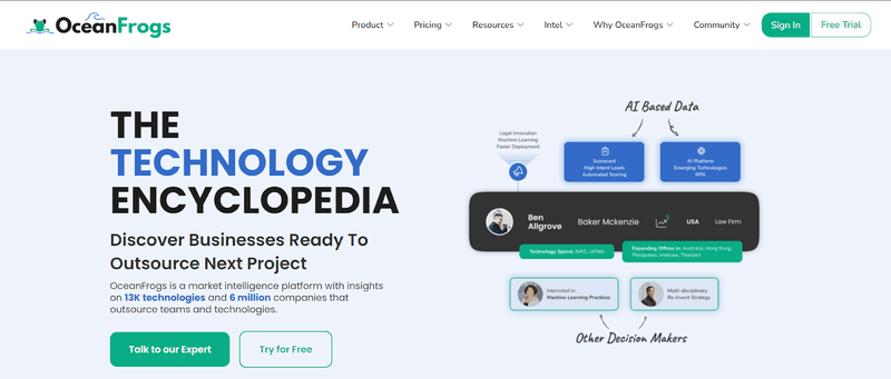
OceanFrog is a prime example of utilizing interactive product walkthroughs to enhance user experience. OceanFrog utilizes product walkthroughs to guide users through their platform's tools, which are designed to help marketers and sales teams identify and connect with targeted accounts.
By using SmartCue, OceanFrogs ensures that users can easily understand the platform's features, onboard quickly, and gain valuable insights.
This approach helps users appreciate the power of data discovery and how it can benefit their marketing and sales efforts.
4 Best Practices for Creating Effective Product Walkthroughs
Designing a powerful and engaging product walkthrough requires adhering to certain best practices. Let's understand these practices.
1. Keep it Simple and Intuitive
Keep walkthroughs simple, clear, and easy to navigate for better engagement.
Use plain language that is easily understandable.
Avoid overwhelming users with too much information at once.
Break tasks into manageable chunks and clearly communicate each step.
Use multimedia (images, short videos) to enhance appeal, but ensure key points remain the focus.
Focus on making users comfortable with product features.
2. Allow Users to Skip or Exit
Avoid forcing users to complete the walkthrough.
Offer an option to skip or exit the walkthrough.
Ensure the walkthrough doesn’t disrupt user flow.
Make the walkthrough an optional resource for users.
3. Test and Iterate for Continuous Improvement
Regularly test and iterate your product walkthrough based on user feedback and behavior.
Use A/B tests to compare different versions and assess changes in user engagement.
Continuously look for ways to improve the walkthrough, such as adjusting content, adding/removing steps, changing design, or incorporating multimedia.
4. Update Content as the Product Evolves
Regularly update product walkthroughs to reflect updates, new features, or design changes.
Ensure walkthrough content remains relevant and in sync with the current product outlook.
Outdated content can confuse users and reduce trust in the product.
Consistent and accurate walkthroughs help build trust and create a positive user experience.
Gather user feedback and complaints about outdated content to guide updates and improvements.
Revolutionize User Engagement with SmartCue’s Product Walkthroughs
Say goodbye to user confusion and hello to seamless onboarding with SmartCue. Our innovative product walkthroughs are designed to do more than guide users—they transform how they experience your product. From the very first click, SmartCue simplifies complex workflows into interactive, intuitive journeys that keep users engaged and empowered.
Whether you're introducing game-changing features or boosting user satisfaction, SmartCue ensures every interaction is impactful. With tailored designs, smart tracking, and personalized experiences, you'll not only enhance engagement but also drive retention and conversions effortlessly.
Ready to turn your product into a user favorite? SmartCue is here to make it happen.
Here’s how you can create a product walkthrough using SmartCue by following the steps mentioned below:
Step 1: Install the SmartCue Chrome extension and log into SmartCue.
Step 2: Create your new showcase.
Step 3: Click Capture New on the dashboard to start the screen recording.
Step 4: Record your screen and perform the walkthrough steps. As you click on each step, the tool will record it as a different step.
Final Words
Creating engaging product walkthroughs is pivotal in enhancing user experience, increasing product adoption, and boosting user retention. By carefully guiding users through the key features of your product, you can significantly impact user activation and drive conversions.
Remember, a seamless onboarding flow not only benefits new users but also ensures the satisfaction and loyalty of existing customers.
So, embrace the power of interactive product tours to deliver a personalized and intuitive experience that resonates with your audience now.
Frequently Asked Questions
How can I make my product walkthrough more engaging?
To make your product walkthrough more engaging, keep it simple and intuitive, personalize the User Experience (UX), allow users to skip or exit the walkthrough, continuously test and iterate for improvements, and keep your content updated as your product evolves.
What are the key elements to include in a product walkthrough?
Key elements to include in a product walkthrough are step-by-step guidance, crucial information about features in an easy-to-understand language, interactive elements like videos or gif images, options to skip or exit the walkthrough, and regular updates reflecting changes in product or features.
How long should a product walkthrough be, and how many steps should it include?
A product walkthrough should last 2-5 minutes and include 5-7 clear, focused steps. This keeps users engaged while effectively guiding them through key features.
How do you choose the right product walkthrough tools?
When choosing a tool for creating a product walkthrough, look for features such as easy-to-use editors, capability for segmenting and targeting users, advanced analytics tools to track user engagement metrics, cross-platform compatibility, ability to automate processes, tour integration, customization options, and multi-language support.

